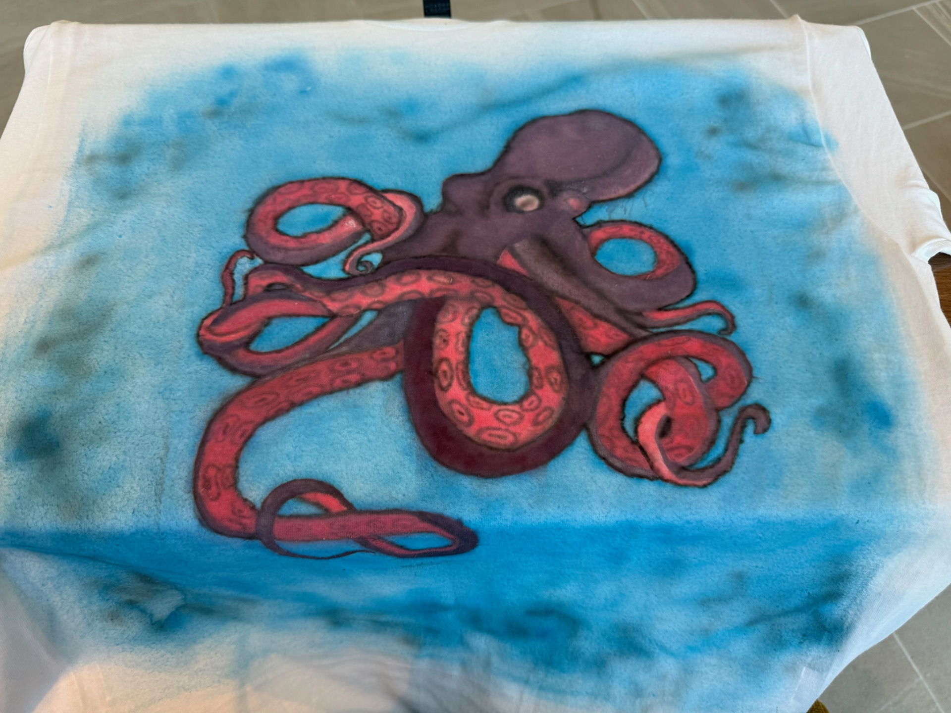
This custom airbrushed octopus tee is built around bold color contrast and clean linework: a deep purple body, saturated red tentacles, and a soft blue water field that keeps the subject floating forward. The goal was to make the octopus read clearly from a distance while still rewarding closer viewing with suction-cup patterning and shading.
I like painting sea life because it naturally fits the airbrush language—soft gradients, atmosphere, and motion. For this shirt, I wanted the octopus to feel dynamic but readable, almost like a logo-level silhouette with illustration depth. The background wash is intentionally loose, like water or ink spreading, while the octopus is tighter and more controlled. That contrast—soft environment vs. crisp subject—is one of the ways I build focus in wearable work.
Because it’s on fabric, everything has to be simplified and high-contrast. I pushed darker outlines and value separation so the form doesn’t disappear once the shirt bends and moves on a body. The red tentacles are the main energy, and the cool blue field keeps the palette balanced and oceanic.
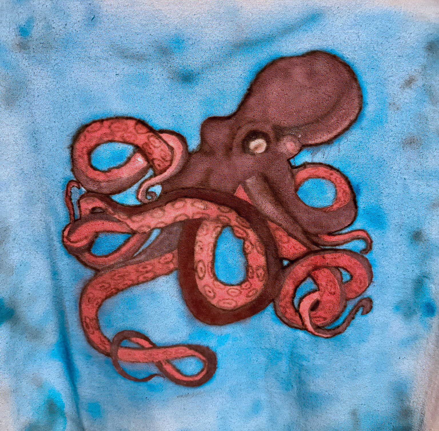
This piece is a good example of what I aim for in airbrushed apparel: strong graphic impact first, then detail. If I redo a version, I’d experiment with a slightly darker vignette around the edges to frame the octopus even harder, but the soft blue field already gives it a nice underwater atmosphere.